
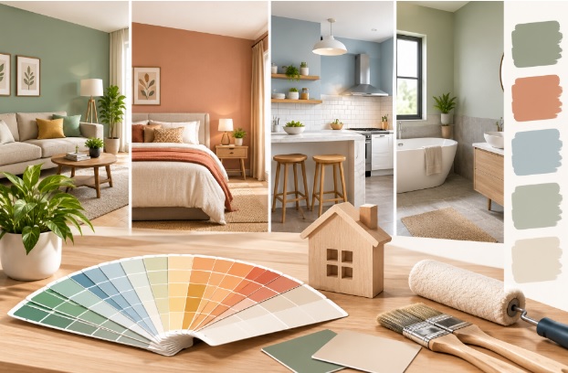
Walk into most homes, and you will notice one common problem: every room was painted separately, at a different time, without a plan, and the colours simply don’t talk to each other. One room feels bright and cheerful, the next feels dull, and the passage between them feels like walking into a completely different house.
Good home painting is not about picking a colour you like for each room in isolation; it is about creating a flow that makes the whole home feel connected while still giving each space its own character.
Start With a Whole-Home View, Not Room by Room
Before you finalise even one shade, look at your home as a single flowing space rather than a set of separate boxes. Most Pune apartments and independent homes have open layouts where the living room, dining area and passage are visible from one another. If you choose colours for each room independently, the transitions between them can look jarring.
A simple fix used in good house painting projects is to pick a base neutral, such as an off-white, warm beige or soft grey, and use it consistently across connecting walls, ceilings or trims, while introducing colour through accent walls in individual rooms.
Understand How Light Changes a Colour
The same shade can look completely different depending on natural light, room size and the direction the room faces. A colour that looks warm and inviting in a well-lit south-facing living room can appear flat or grey in a north-facing bedroom with limited daylight. Before committing, always test a sample patch on the actual wall and view it at different times of day (morning, afternoon and evening) under both natural and artificial light. This single step prevents most colour regrets after interior painting is complete.
Matching Colour to Room Function
Different rooms serve different purposes, and colour can support that function. Living rooms and dining areas, where families spend time together, generally work well with warmer, welcoming tones. Bedrooms benefit from calmer, muted shades that support rest rather than stimulation. Kids’ rooms can take brighter, more playful colours since they are meant to feel energetic.
Kitchens and utility areas often do well with practical, easy-to-clean finishes in lighter shades that make the space feel open. Thinking about function first, rather than trends alone, leads to choices you won’t tire of quickly.
Use a Restrained Palette
One of the easiest ways to keep a home visually connected is to limit yourself to two or three core colours across the entire house, with variations in shade or finish rather than introducing a completely new colour in every room.
For instance, a soft sage green in the living room can be echoed as a lighter tint in an adjoining passage, rather than switching to an unrelated colour like maroon or navy. This kind of restraint is a hallmark of professional home painting services and is far easier to maintain and touch up over the years.
Don’t Underestimate the Number of Shade Options Available
Many homeowners default to the same handful of “safe” colours simply because they aren’t aware of how many options actually exist. Professional painting services today typically work with catalogues offering 2,000 or more shades and hundreds of texture finishes, which means there is almost always a version of the colour you’re imagining that fits your specific lighting and room size, rather than settling for the nearest match on a small physical colour card.
Get an Expert Opinion Before You Finalise
If you are unsure how a colour scheme will look across your whole home, it is worth getting an expert consultation before painting begins. An experienced colour consultant or painter can walk through your home, look at how light moves through each room, and suggest a palette that flows naturally from one space to the next rather than clashing at doorways and corners.
Consider Finish, Not Just Colour
Colour is only half the decision; the finish you choose also affects how connected a home feels. Mixing a high-gloss wall in one room with a completely matte wall next door can make the transition feel abrupt, even if the colours themselves are similar. Sticking to a consistent finish family, such as matte or low-sheen for most living spaces, with satin or semi-gloss reserved for high-touch areas like kitchens and doors, keeps the overall look unified. Quality of the paint used matters here too, since premium products tend to hold their finish and colour truer over time compared to lower-grade options that can yellow or patch unevenly within a couple of years.
A Home That Feels Whole
Choosing paint colours doesn’t have to mean picking a new shade for every room and hoping it works out. With a whole-home perspective, attention to natural light, colour choices tied to room function, a restrained and connected palette, and consistency in finish, house painting can transform a home into a cohesive, comfortable space rather than a patchwork of disconnected rooms. Whether you are repainting one room or planning painting services for the entire home, a little planning before the brushes come out goes a long way toward a result that feels considered rather than accidental.